In this blog post, we’ll explore how to build a dynamic Carousel component in Optimizely using the Content JS SDK. We’ll work with a Content Type that has a Content Area field — one that accepts multiple allowed block types — and wire it all up to a React
frontend that handles every block type automatically.
When you allow multiple block types inside a Content Area, each block brings its own set of fields and its own layout. A BannerBlock might have a title, an image, and a CTA link — while an AppBlock might have an app icon and a store URL. Because of these differences, the frontend cannot treat every block the same way. Before rendering anything, it has to identify the content type it received and decide exactly how to present it in the UI. The naive approach on the frontend looks something like this:
// ❌ The approach that haunts you later
const blockType = item.contentType?.[1];

if (blockType === 'BannerBlock') {
  return <BannerBlock data={item} />;
} else if (blockType === 'AppBlock') {
  return <AppBlock data={item} />;
} else if (blockType === 'PromoBlock') {  // added next sprint...
  return <PromoBlock data={item} />;
}  // ...and it never stops growing
React children gives us a cleaner way out. Using a composition pattern, we can separate the two concerns that keep colliding — CMS content type resolution and carousel UI rendering — so that neither one ever has to care about what the other is doing.
Preparing the CMS: Defining Allowed Carousel Blocks
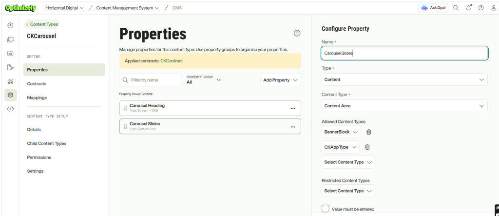
For this example, I’ve created a content type called CKCarousel with two fields: CarouselHeading and CarouselSlides. The CarouselSlides field is defined as a Content Area, allowing content authors to add multiple blocks while restricting the allowed types to BannerBlock and CKAppType, as shown below.
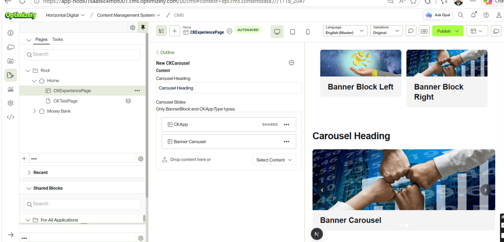
The CKCarousel content type is then added to an Experience Page, where the content is structured as shown below.
Turning the Content Model into Code
Now that the content types have been modeled and added to the page, let’s look at how to build a dynamic carousel capable of rendering multiple content types while keeping the carousel component completely unaware of the specific blocks it displays.
The content type modelled in Optimizely SAAS are pulled into the Head app through running the below command.
npx @optimizely/cms-cli config pull --output ./src/content-types --group
With the models pulled into the file system, let’s add the code for the carousel component.
- Start by creating a CKCarousel.tsx component under src/components/component that will be responsible for rendering the CKCarousel content type.
import type { ContentProps } from '@optimizely/cms-sdk';
import { getPreviewUtils, OptimizelyComponent } from '@optimizely/cms-sdk/react/server';
import type { CKCarouselCT } from '@/src/content-types/component/CKCarousel';
import BannerCarousel from '@/src/components/component/BannerCarousel';

type CKCarouselContent = ContentProps<typeof CKCarouselCT>;

type Props = {
  content: CKCarouselContent;
  displaySettings?: Record<string, string | boolean>;
};

export default function CKCarousel({ content }: Props) {
  const { pa } = getPreviewUtils(content);

  return (
    <section className="w-full">
      {content.CarouselHeading && (
        <h2
          {...pa('CarouselHeading')}
          className="mb-6 text-3xl font-bold tracking-tight text-zinc-900 dark:text-zinc-50"
        >
          {content.CarouselHeading}
        </h2>
      )}

      {content.CarouselSlides && content.CarouselSlides.length > 0 && (
        <div {...pa('CarouselSlides')}>
          <BannerCarousel>
            {content.CarouselSlides.map((item, index) => (
              <OptimizelyComponent
                key={(item as { _metadata?: { key?: string } })._metadata?.key ?? index}
                content={item}
              />
            ))}
          </BannerCarousel>
        </div>
      )}
    </section>
  );
}
The CKCarousel component retrieves the CarouselHeading and CarouselSlides properties from the CKCarousel content type and renders them within a reusable carousel container. Each item in the CarouselSlides Content Area is passed to OptimizelyComponent, which leverages the Content JS SDK’s component resolution mechanism to dynamically map the content item’s type to its corresponding React component at runtime. This approach eliminates the need for manual content type checks or conditional rendering logic, allowing the carousel to support any registered block type while remaining completely agnostic of the content it displays.
The server component maps CMS content to React components using OptimizelyComponent, which dynamically resolves the appropriate component from the registered component registry (such as BannerBlock or CKAppType) based on each item’s content type. The resolved components are then passed as children to BannerCarousel, allowing the carousel to remain completely unaware of the specific content types it is rendering. Behind the scenes, BannerCarousel ultimately receives a collection of fully resolved React components similar to the following:
<BannerCarousel>
    <CKAppType />  → Block 1
    <BannerBlock /> → Block 2
</BannerCarousel>
2. Now, let’s implement the BannerCarousel component that will receive the resolved content blocks as children and render them as carousel slides.
'use client';

import { Children, useState, useEffect, useCallback, type ReactNode } from 'react';

type Props = {
  children: ReactNode;
};

export default function BannerCarousel({ children }: Props) {
  const slides = Children.toArray(children);
  const [current, setCurrent] = useState(0);
  const [paused, setPaused] = useState(false);
  const total = slides.length;

  const goTo = useCallback(
    (index: number) => setCurrent(((index % total) + total) % total),
    [total],
  );

  useEffect(() => {
    if (paused || total <= 1) return;
    const id = setInterval(() => setCurrent((i) => (i + 1) % total), 5000);
    return () => clearInterval(id);
  }, [paused, total]);

  if (total === 0) return null;

  return (
    <div
      className="relative w-full overflow-hidden rounded-lg bg-zinc-100 dark:bg-zinc-800"
      onMouseEnter={() => setPaused(true)}
      onMouseLeave={() => setPaused(false)}
    >
      <div
        className="flex transition-transform duration-500 ease-in-out"
        style={{ transform: `translateX(-${current * 100}%)` }}
      >
        {slides.map((slide, i) => (
          <div key={i} className="w-full flex-shrink-0">
            {slide}
          </div>
        ))}
      </div>

      {total > 1 && (
        <>
          <button
            type="button"
            onClick={() => goTo(current - 1)}
            aria-label="Previous slide"
            className="absolute left-3 top-1/2 -translate-y-1/2 rounded-full bg-black/40 p-2 text-white backdrop-blur-sm transition hover:bg-black/60"
          >
            <svg xmlns="http://www.w3.org/2000/svg" className="h-5 w-5" viewBox="0 0 20 20" fill="currentColor">
              <path fillRule="evenodd" d="M12.707 5.293a1 1 0 010 1.414L9.414 10l3.293 3.293a1 1 0 01-1.414 1.414l-4-4a1 1 0 010-1.414l4-4a1 1 0 011.414 0z" clipRule="evenodd" />
            </svg>
          </button>
          <button
            type="button"
            onClick={() => goTo(current + 1)}
            aria-label="Next slide"
            className="absolute right-3 top-1/2 -translate-y-1/2 rounded-full bg-black/40 p-2 text-white backdrop-blur-sm transition hover:bg-black/60"
          >
            <svg xmlns="http://www.w3.org/2000/svg" className="h-5 w-5" viewBox="0 0 20 20" fill="currentColor">
              <path fillRule="evenodd" d="M7.293 14.707a1 1 0 010-1.414L10.586 10 7.293 6.707a1 1 0 011.414-1.414l4 4a1 1 0 010 1.414l-4 4a1 1 0 01-1.414 0z" clipRule="evenodd" />
            </svg>
          </button>
        </>
      )}

      {total > 1 && (
        <div className="absolute bottom-3 left-1/2 flex -translate-x-1/2 gap-2">
          {slides.map((_, i) => (
            <button
              key={i}
              type="button"
              onClick={() => goTo(i)}
              aria-label={`Go to slide ${i + 1}`}
              className={`h-2.5 w-2.5 rounded-full transition ${
                i === current ? 'bg-white' : 'bg-white/50 hover:bg-white/75'
              }`}
            />
          ))}
        </div>
      )}
    </div>
  );
}
The BannerCarousel component is implemented as a client component and follows a composition-based design by accepting resolved React components through its children prop. It converts the incoming children into a normalized array using Children.toArray(), enabling generic slide management without any knowledge of the underlying Optimizely content types. By operating on a uniform collection of React elements, the carousel treats each child as a slide, regardless of whether it represents a BannerBlock, CKAppType, or any other content type registered in the component registry.
3. Finally, register the CKCarousel component in the Optimizely component registry so that content items of type CKCarousel can be automatically resolved and rendered by OptimizelyComponent.
import { initContentTypeRegistry } from '@optimizely/cms-sdk';
import { initReactComponentRegistry } from '@optimizely/cms-sdk/react/server';
import CKCarousel from '@/src/components/component/CKCarousel';
import { CKCarouselCT } from '@/src/content-types/component/CKCarousel';

initContentTypeRegistry([CKCarouselCT]);

initReactComponentRegistry({
  resolver: {
    CKCarousel: CKCarousel,
  },
});
This approach keeps content type resolution separate from presentation logic, allowing the carousel to remain reusable and extensible as new block types are introduced over time.
Final Thoughts
When working with Optimizely Content Areas that support multiple block types, it’s tempting to introduce content type checks directly into UI components. While this may work initially, it quickly becomes difficult to maintain as new content types are added over time.
By leveraging the Content JS SDK’s component registry together with React’s composition pattern, we can cleanly separate content type resolution from presentation logic. The OptimizelyComponent takes care of mapping CMS content to the appropriate React component, while the carousel remains focused solely on rendering and user interaction.
This approach results in a more modular, reusable, and extensible architecture. New block types can be supported by simply registering their corresponding React components, without making any changes to the carousel implementation. This keeps the carousel reusable, reduces maintenance overhead, and allows the solution to scale as the number of supported content types grows.
Happy Optimizing!!!
 Lets unveil Optimizely